Too Good to Be Legit: The Designers Making Art That Looks Like It Wants Your Credit Card Number
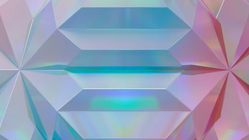
The album cover looks wrong from the jump. The gradient is too aggressive — the kind of electric teal-to-gold that you associate with a cryptocurrency that no longer exists. The font is doing something suspicious with drop shadows. There's a stock photo of a man in a suit gesturing confidently toward a bar chart that has no discernible data on it. In the lower right corner, in a starburst shape: LIMITED AVAILABILITY.
This is not a scam. This is one of the more carefully considered pieces of graphic design released this year, made by a designer in Chicago who spent three weeks perfecting the specific visual grammar of financial fraud. The album it represents is an experimental electronic record about economic anxiety, and every single aesthetic choice is deliberate, researched, and, in its own way, gorgeous.
Welcome to scam aesthetic — the movement nobody has quite named yet, in which designers, album artists, and web builders are mining the visual language of Ponzi schemes, multi-level marketing decks, and too-good-to-be-true internet offers as a source of genuine artistic expression.
Why Fraud Looks the Way It Does
To understand what these designers are doing, it helps to understand why fraudulent visual language developed the way it did in the first place.
The aesthetics of financial scams, MLM recruitment materials, and sketchy online offers aren't accidental. They're the result of decades of optimization for a very specific psychological target: the moment when someone's skepticism is just barely outweighed by their hope. The visual grammar is designed to trigger aspiration while preemptively neutralizing doubt. The aggressive gradients signal energy and momentum. The testimonial-style typography implies social proof. The stock photos of confident, successful-looking people create an association between the product and a life you want.
It's actually a sophisticated visual system. It just happens to be deployed in service of taking people's money.
What the designers working in scam aesthetic are doing is essentially decontextualizing that system — pulling the visual vocabulary out of its original purpose and asking what it means when you encounter it without the accompanying financial threat. What does it feel like to look at something that triggers all your fraud instincts but isn't actually trying to defraud you? What does it mean to make something beautiful using the specific tools of deception?
The Designers Doing the Work
K., a freelance designer and visual artist based in Los Angeles, has been working in what she calls "trust collapse aesthetics" for about two years. Her portfolio includes album art, event posters, and a series of web mockups that look exactly like the landing pages of companies that will be investigated by the FTC within eighteen months.
"I got interested in it during the crypto boom," she told us. "I was watching all this money move around based almost entirely on visual confidence. The logos, the websites, the pitch decks — they all had this very specific look. And I started thinking, that look is doing a lot of work. What is it actually communicating? What happens if you use it to communicate something true?"
Her most recent project is a poster series for an imaginary wellness company. The posters feature the complete toolkit: soft-focus photography of people in expensive athleisure looking meaningfully into the middle distance, a tagline that promises transformation without specifying what kind, a color palette that whispers "clinical" and "premium" simultaneously. They're also, genuinely, beautiful objects. The craft is evident. The irony is real, but it doesn't cancel the aesthetics — it lives alongside them.
"I want people to feel the pull and then feel themselves feeling the pull," she said. "That double awareness is the whole piece."
D., a graphic designer in Brooklyn who makes album art for independent artists, comes at it from a different angle. He grew up in a household that was targeted by MLM recruitment, and his work with scam aesthetic is more explicitly critical — though no less visually sophisticated.
"MLM visual language is designed to look like success culture," he explained. "It's aspirational design weaponized against people who don't have the cultural context to decode it. I'm interested in making that weaponization visible. If you can see the mechanism, you can't be as easily fooled by it."
His album covers tend to feature the specific typography of motivational content — bold, italicized claims in fonts that suggest urgency — applied to song titles that undercut the confidence completely. The gap between the visual promise and the lyrical reality is where the meaning lives.
The Line Between Critique and Complicity
The obvious tension in this work is whether using the tools of manipulation, even critically, ultimately normalizes them. If a design looks exactly like a scam, does the artistic intent matter to someone who doesn't have the context to read it as art?
This is a real concern, and the designers working in this space engage with it to varying degrees. Some are careful to introduce enough visual friction — a detail that's too strange, a reference that breaks the frame — to signal that something else is happening. Others are deliberately uninterested in making the critique legible, arguing that the discomfort of not knowing is part of the work.
"I don't want to put a little wink in there that tells you it's okay," K. said. "The wink lets you off the hook. I want you to sit in the uncertainty."
What This Aesthetic Is Actually About
Strip away the irony and the craft conversation, and what scam aesthetic is really engaging with is something pretty urgent: the complete collapse of visual trust online.
We live in an information environment where the most dangerous content is often the most polished, and where legitimacy is increasingly performed through aesthetics rather than earned through substance. A well-designed website is taken as evidence of credibility. A professional-looking pitch deck moves money. The visual grammar of trustworthiness has been so thoroughly gamed that it no longer reliably indicates trustworthiness.
The designers working in scam aesthetic are making that visible. They're taking the tools of manufactured credibility and using them to make art that is, paradoxically, more honest than most design you'll encounter today — because it's upfront about the fact that it's trying to make you feel something.
There's something almost refreshingly direct about an album cover that looks like a Ponzi scheme. At least you know what it's doing to you.